iPhone 4 and iOS 4 Safari detection & behavior
 by Maximiliano Firtman
About 5 min reading time
As you may know, iPhone 4 was released a few days ago; I didn’t buy an iPhone 4, but I’ve just been in Apple Store San Francisco making some testing over iPhone 3GS with iOS4, iPhone 4 and also with my iPad (iOS 3.2) and iPod Touch (iOS 3.1). After that, I’ve found many interesting behaviors that worth to be mentioned here. Unfortunately, there is no official documentation in Safari Guidelines for iPhone 4 yet to listen an official version.
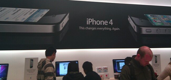
“This changes everything”, a great quote for starting my post
In the following lines you will find analysis on CSS Media Queries, Viewport, JavaScript, performance and webapps behavior with iPhone 4 and iOS 4.
CSS Media Queries in iPhone 4 #
iPhone 4’s screen has 326 PPI (or DPI if you like) with a 640×960 screen. As you may know (if not, look at my book), Safari on iOS supports media queries, so many sites created a different CSS code or external file for iPhone. The code should look like
<link media="only screen and (max-device-width: 480px)" href="iphone.css" type="text/css" rel="stylesheet" />So, looking at the max-device-width (480 pixels for the original iPhone and iPod Touch) we can conclude that iPhone 4 will not use this CSS file, because the media condition appears to be false.
Here comes the not-expectable (but understandable) behavior: iPhone 4 acts EXACTLY THE SAME as the original iPhone, so yes, it will use that CSS file. In fact, I’ve tested a max-device-width: 480px and a max-device-width: 960px and iPhone 4 took the first one! I’ve found a post in a blog (I’ve removed the link to avoid confusion) claiming that iPhone 4 supports the resolution attribute inside media, so we can then decide which CSS or which WebClip icon for the homepage use if it is an iPhone (low DPI with 163dpi), or an iPhone 4 (high DPI with 326dpi). But when I tested the code, it doesn’t work. iOS 4 does not support the resolution attribute at the media query in the link. When this condition is applied, no CSS is loaded and the latest WebClip defined is used (not matter which media it has).
But iOS 4.0 does support the extension -webkit-min-device-pixel-ratio as an attribute for a media condition, as it appears to be working fine with iPhone 4 and iPhone 3GS. The iPhone 4 has a pixel-ratio relation of 2 from the original iPhone, so we can use a global CSS file and then another CSS file that will execute on iPhone 4 doing:
<link href="global.css" type="text/css" rel="stylesheet" />
<link media=”all and (-webkit-min-device-pixel-ratio:2)” href=”iphone4.css” type=”text/css” rel=”stylesheet” />
Devices without support for this extension, will just ignore the reference because the condition is false when it is an unknown condition
WebClip icon for iPhone 4 #
For now, the best solution is to just use the maximum WebClip size (114×114), so older iPhones will resize it. We can also leave the original 57×57, but I will not have the best resolution after a 2x resize on iPhone 4.
JavaScript window size #
Making a simple JavaScript test on iPhone 4, I’ve also detected that screen.width and screen.height are returning 320 and 480 and document.documentElement.clientWidth and document.documentElement.clientHeight are returning 320 and 460 (the 20px are for the status bar, that is 40 real px on the iPhone).
Therefore, Safari on iOS is not returning real physical pixels, but virtual CSS pixels, having iPhone 4 a 2:1 relation, the same DPI relation with the classic devices. If you don’t understand yet the concept think that, if the user zooms in our out the page, px are also relative, so this is a similar situation.
More information about DPI-relative pixels in http://webkit.org/blog/55/high-dpi-web-sites/ With this decision, Apple decided to give iPhone 4 automatic support for every iPhone-optimized website available in the web, including websites using iUI and jQTouch, both visual frameworks for iPhone development, like if the default viewport has a zoom of 2x.
So, if you have created already an iPhone-optimized website, you don’t need anything else to be fully compatible with iPhone 4. If you want to make something different for iPhone 4, these are bad news.
Viewport in iPhone 4 #
When the viewport is defined as device-width, 320 will be that value in iPhone 4. You can still have “full 100% real pixels” if you define your viewport as:
<meta name="viewport" content="width=640" />But it is still not a good idea for future compatibility. And how are you sure that it is an iPhone 4?
Multitasking and JavaScript #
Perhaps you really believed that iOS 4 supports multitasking. I’m sorry to disappoint you, but it is not really multitasking, but it seems very similar. Safari, in fact, doesn’t work with real multitasking. A simple testing, shows that iOS 4 stops every JavaScript code that you are executing when the user change to another foreground application.
Other expected behavior that I’ve found is when a background-service application is running. I’ve opened Pandora and start a playlist. I come back to Safari while “While my guitar gently weeps” is playing and I’ve run a JavaScript timer. The timer, every x seconds, slow down its execution between 4x and 10x; that’s the Pandora service running in the background. So, we should expect lower performance on webapps while some services are in the background, bad news for high performance. Ok, you can say that this is also happening on other multitasking devices.
A good news: JavaScript code appears to execute 2x-4x faster than in classic iPhone, even for parsing frameworks, like jQuery.
Rotation media support #
iOS 4, as iPad with iOS 3.2, supports the media orientation attribute, so you can apply different styles for portrait and landscape orientations. For example:
<link rel=”stylesheet” media=”all and (orientation:portrait)” href=”portrait-style.css” />
<link rel=”stylesheet” media=”all and (orientation:landscape)” href=”landscape-style.css” />
Remember that you can also use this media queries inside one CSS declaration using @media and inside a style tag also. You can also mix orientation condition with -webkit-min-device-pixel-ratio.
iPhone 4 detection #
This is a big issue for statistics and maybe if you are thinking on a special high-DPI version for iPhone 4. JavaScript objects return same values and the User Agent is the same. This is the User Agente for iPhone 4 and classic iPhone/iPhone 3GS with iOS 4:
Mozilla/5.0 (iPhone; U; CPU iPhone OS 4_0 like Mac OS X; en-us) AppleWebKit/532.9 (KHTML, like Gecko) Version/4.05 Mobile/8A293 Safari/6531.22.7So, my only bet about detecting if the device is an iPhone 4 is to use media queries to change any CSS property and then verify using JavaScript dynamically if that is the value that is being applied.
Parallel downloads #
As I’ve mentioned in my last workshop at Velocity 2010, iOS 2.0 supports 4 parallel downloads per domain, and that limit was elevated to 6 parallel downloads in iOS 3.0. Great! Up to now, iPhone OS 4 and iPhone 3GS with iOS 4 goes back to 4 parallel downloads per domain, maybe they tested that it is better? Os just going back to an old code? Who knows. These are those times where we want to have some people from inside Apple blogging and talking about development issues.
Webapps in home screen behavior #
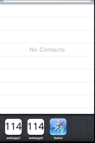
Using some meta tags, we can make our webapp to work in full-screen mode, launched from the Home Screen.
Well, I have one good news and two bad news.
Starting but the good news, if you open more than one webapp from the Home Screen, everyone appears as an individual icon like other native application in the multi-tasking application list after double tapping the Home button.
The bad news? If you have a webapp in foreground and try to switch to other webapp, it just doesn’t work. It looks like a bug, the screen flips one millisecond and then goes to the Home screen, closing the destination webapp and the first one. Remember that even when a webapp in apparently background mode, it is not executing any JavaScript.
The second bad news, other bug. A full-screen webapp can include a default startup image that it is used by the opening animation. This image must be the same size as in iOS 3.0, even for the high-DPI iPhone 4. And, the animation starts with a whole white image and when the animation finished, your default startup image will shown for some milliseconds and then replaced by your page. So, it generates an annoying effect, because the startup image is not used by the animation.
I believe these bugs will be solved with some iOS 4.01 update in the near future.