Safari on iOS 9.3
Responsive Images, iPhone SE, shrink-to-fit and other new APIs
 by Maximiliano Firtman
About 5 min reading time
Usually minor updates on iOS don’t bring news to Safari and web developers. That’s not the case on iOS 9.3: new APIs, support for Responsive Images, a new weird viewport attribute and new devices in the market make us check what’s new.
Overview #
Changes with iOS 9.3 for web developers and designers:
- iPhone SE is equal to iPhone 5(s)
- iPad Pro 9.7″ is equal to iPad Mini / Air but with 3D Touch support when Apple Pencil is used. Images with ICC profile are now supported
- Responsive Images with
<picture>now supported - Fast Tap: 300ms delay removed
- CSS Variables and Will-Change now supported
- New JavaScript Dialogs system
- Minor changes: hi-quality canvas, CSS small additions and Advanced Font styles
New devices #
The new 4” iPhone SE (Something edition?) device is the same as iPhone 5(s) in terms of web design and development. That means a viewport of 320 CSS pixels when a mobile viewport meta tag is used (compared to 360 CSS pixels of iPhone 6 and 414 CSS pixels of 6+), and a device pixel ratio of 2. No 3D Touch is supported.
In terms of iPads, the new 9.7” iPad Pro (yes, that’s the official name) exposes same viewport as iPad Air and iPad Mini compared with the original 12.9” iPad Pro. Touch Events v2 API is supported when used with Apple Pencil (that is, the force value is available on each Touch object).
Aos, the 9.7” iPad Pro has a new display supporting Wide Color and True Tone so we have a better range of colors available. Well now Safari now supports Images with ICC Profiles inside (confirmed on Twitter) so if you work in professional imaging you may be happy about this. A CSS Media Query to detect displays that support more colors is on the way for a future version (it’ll be great for the new picture element)
Responsive Images with picture #
The HTML 5.1 <picture> element has finally arrived to Safari (both iOS and Mac), so we can now finally embrace Responsive Images with native support. The picture element allows us to define multiple image sources based on a media query and/or a format type using different <source> child elements (à la <video> element). We can use alternatives for art direction or to support different formats.
Therefore, we can define different images candidates based on different rules, such as the viewport’s size, with a fallback <img> tag.
Also, it can be mixed with srcset to provide different resolution versions and with type we can use several image types if we want to offer different versions. This feature can be used to support new formats (such as WebP, JPEG-2000, JPEG-XR, SVG or future formats) without JavaScript frameworks or server-side detection. For example, we can serve WebP versions for Chrome/Firefox users and PNG versions for iOS and other devices.
Fast Tap: 300ms delay removed #
At this point we all know that on iOS we have a ~300ms delay on every click event (including when you tap on a link) before actually firing it to wait for a second tap.
Starting with iOS 9.3, Safari won’t have this delay on any content if one of two rules are met: 1) a mobile viewport, either with width=device-width or user-scalable=no or 2) using the touch-action: manipulation CSS attribute (coming from the Pointer Events spec that Apple actually don’t support) on elements and containers.
Great news for web performance!
CSS Variables #
CSS Variables finally arrived to iOS following other browsers. You might want to use it only when it’s supported so you can use backward values, @support or JavaScript’s CSS.supports to detect them.
CSS Will-Change #
Safari now supports the CSS Will Change spec that is great for optimizing performance. The will-change property lets us specify that one particular element will have some chances (for example we will animate it later, or we will change its content) so the browser can apply some performance improvements on it, such as using a hardware GPU layer on it or not.
Gesture events on Mac #
Since Safari on iOS 2.0 we have non-standard gesture events to detect pinch and rotate gestures on iOS devices usually through gesturechange. These events are also available on Safari on the Mac when the user has a trackpad with gesture support, such as a MacBook or a Magic Mouse/Trackpad.
New Dialogs #
JavaScript dialogs on Safari were using native iOS dialogs until today. Since 9.3, these dialogs (alert, confirm and prompt) changed the design. The new design looks different (see next image) and they don’t have the domain of the current website as a title.
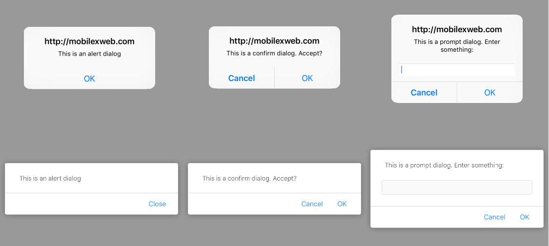
Old JS Dialogs (top) and new JS Dialogs (bottom)
The main purpose of the change is usability. The new dialogs are modal within the tab but not within Safari. Therefore, you can change tabs, close the tab, get the URL bar or the toolbar (including back button) while a dialog is open. Before iOS 9.3 you had to close the dialog first. And now a background tab can’t request focus sending a modal popup.
These new dialogs are not available on Home Screen webapps or Web Views.
The new viewport shrink-to-fit attribute (that nobody understands) #
Apple has added a new shrink-to-fit attribute to the viewport meta tag that I’m sure most people don’t understand. Let’s see what it means.
On iPad with iOS 9 we know we can have Safari running in Side view or Split view mode adding 9 more viewport’s widths to the default 2 on iPad (portrait and landscape). The new widths have to do with running Safari in 1/2 , 2/3 and 1/3 mode (both in viewport and landscape, for 7.9” and 9.7” iPads in one group and 12.9” iPad Pro in other group).
From iOS 9.0 Safari is exposing the actual viewport width instead of the typical 769px to the website so you can use responsive techniques to actually re-layout the content.
However, some websites (mostly doing user agent detection) thinks that if it’s an iPad (a tablet), then the width is at least 768px so the design have issues on smaller values that we get on Split/Side mode on iPad. Therefore, Apple since 9.0 implemented a solution: if your content has overflowed content on these smaller size modes, Safari makes a bigger viewport (up to 768px) and shrinks the content so it fits on the screen.
However, this idea also created lot of bugs on other websites with overflow content that instead of having a horizontal scrollbar as expected, they are being shrunk.
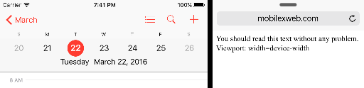
For example let’s say we have a width=device-width viewport meta tag, therefore the available viewport’s width should be equal to 320, 360, 438, 507, 639, 678, 694 or 981 as you can see in next image at the right (based on the iPad and situation – check my previous post for info).
Now, let’s say we have content with a fixed width of 600px and the user is not using a full-width Safari on the iPad. On these situations, Safari will expose a viewport of 600px (actual content) and the content will shrink to fit to the real viewport as in next image, so your text will be smaller than the standard size.
<meta name="viewport" content="width=device-width">
<div style="width: 600px; height: 50px”>600px element</div>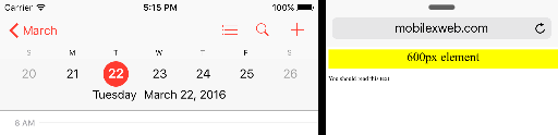
If you prefer to keep your viewport as expected and have horizontal scrollbars for the overflowed content, you can add a new attribute to the meta tag: shrink-to-fit=no and get that result as you can see in next image (bottom).
<meta name="viewport"content="width=device-width,shrink-to-fit=no">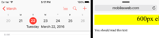
Remember: this behavior happens only when the user is using your website with Safari in Split or Side View modes.
Remote Inspector #
The Remote Inspector has new features, including:
- Watch Expressions while debugging JavaScript
- New Visual Styles sidebar editor (see image below)
- HTML pseudo-elements are now visible in the DOM
Minor improvements #
- High Quality Rendering Canvas can be requested through a new imageSmoothingQuality property accepting “high” as a value
- CSS border-image-repeat now accepts round and space
- The “all”, “revert” and “unset” attributes are now accepted to clear cascading attributes
- Advanced typographical settings for OpenType now available (such as font-variant-numeric). Check CSS Fonts v3 for more info: https://www.w3.org/TR/css-fonts-3/#font-variant-prop
- CSS Filters are now unprefixed
Have you find anything else? Let me know and I’ll update this post.