PWAs Power Tips
Improving design and user experience
About 12 min reading time
Progressive Web Apps (PWAs) are part of the current DNA for the mobile web and even the desktop app space starting from this year. Any website can be now an installable offline-capable app thanks to new technologies and APIs in the Web Platform offering similar experiences to native apps once installed.
To provide the best possible experience, the designers need to make an effort in providing a fast and mobile-optimized user experience, helping the user to navigate, install and use their apps. Now with app store distribution support available, professionals need to pay attention to every detail when they offer a web-based progressive app.
Understand the reach of your PWA #
To create the best possible experience testing our user interface in all the possible platforms for the users is needed. While a PWA will work on every browser, to leverage the advantages of PWA as a standalone, offline-capable app, there is a list of compatible platforms and browsers.
On iOS, it will be compatible with iPhone, iPod touch, and iPad since iOS 11.3 using Safari only. On Windows 10, Microsoft Store will publish your PWA if Bing crawls it. On Chromebooks, they are fully installable since Chrome OS 67. On Android, the best experience comes with Chrome, but they can also be installed from Samsung Internet, Firefox, Edge, Opera and UC.
On features phones, KaiOS supports PWAs from an internal store. Finally, Chrome for desktop (Windows, macOS, and Linux) will have support for installable PWAs soon; it’s available to test today enabling the flag “Desktop PWA” from chrome://flags.
Help the User Install the App #
When a user browses a website the resources from the PWA will be installed thanks to Service Workers, but the app is not installed in the OS automatically. Not every user will know that installation is available and how to trigger that action from the browser. Therefore, promoting the action through a non-intrusive hint might help installation if you show that advice on the display-mode: browser media query only.
On some browsers, triggering the installation dialog is now possible from the web’s user interface such as with an “Install” menu or button. The “beforeinstallprompt” event on the window object fires when the browser recognizes a PWA, and it’s ready to show the installation prompt; using the event’s argument, the handler should cancel default browser’s behavior with preventDefault() and save the argument for later in a global variable. When the user clicks on the custom UI element, the app should call prompt() on the saved variable.
A new responsive breakpoint: Mini mode #
Typical responsive breakpoints expect a minimum viewport of a mobile phone- 320x400 CSS pixels. But with PWAs on the desktop, there is a whole new dimension of breakpoints we might want to consider. An installed PWA uses a resizable window of any size, including a tiny widget-like size, such as 200x100 CSS pixels. A mini mode can be created for this unique situation, that will only render a summary of the content and quick actions for the user to keep it visible all the time.

Small viewports don’t end with desktop PWAs: typical KaiOS feature phones supporting PWAs, such as the latest Nokia 8110, are exposing a viewport of 240x228 on a non-touch screen. And also, from Apple Watch Series 3 with watchOS 5, there is a web browser available when the user clicks on a link, exposing small viewports when adding the tag
<meta name="disabled-adaptations" content="watch">Provide good PWA icons #
A PWA will be recognizable by its icon and short name defined in the manifest. On today’s platforms, only PNG icons are supported. For app stores and launch screens, a 512x512 pixels icon is mandatory, and a 1024x1024 version is recommended. Android uses 48dp transparent icons; the resolution will define the actual size.
On most Android devices, 192x192 (4x density) and 144x144 (3x density) will be needed. Adaptive Icons available from Android 8 is a new way to create icons using a variety of shapes to be used across different device models, but this format is not yet available on PWAs.
iOS is entirely different as it doesn’t support transparent icons. The PWA must supply square icons with no transparency and no rounded corners; iOS will round them. And the icons must be defined through a <link rel=”apple-touch-icon”> elements in the HTML accepting the standard sizes property.
App’s Lifecycle #
While in traditional web development a website is in memory and execution while the tab is opened even if it’s not on the screen, in the PWA world users don’t close apps, they get out of them with the home button or a gesture. Understanding the lifecycle is critical to provide a good user experience.
On iOS, a standalone PWA gets discarded every time the user moves to other app or Home Screen and can be detected through Page Visibility events.
Using Chrome or a standalone PWA on Android, the web content will freeze at one point when in the background (a ‘freeze’ event will be fired) and might resume later. Sometimes the user gets back to the app after several hours or days; at that point, the content was discarded from memory, and it will load from scratch. Checking ‘document.wasDicarded’ and reloading the previous state of the app will create a consistent experience.
Web Share #
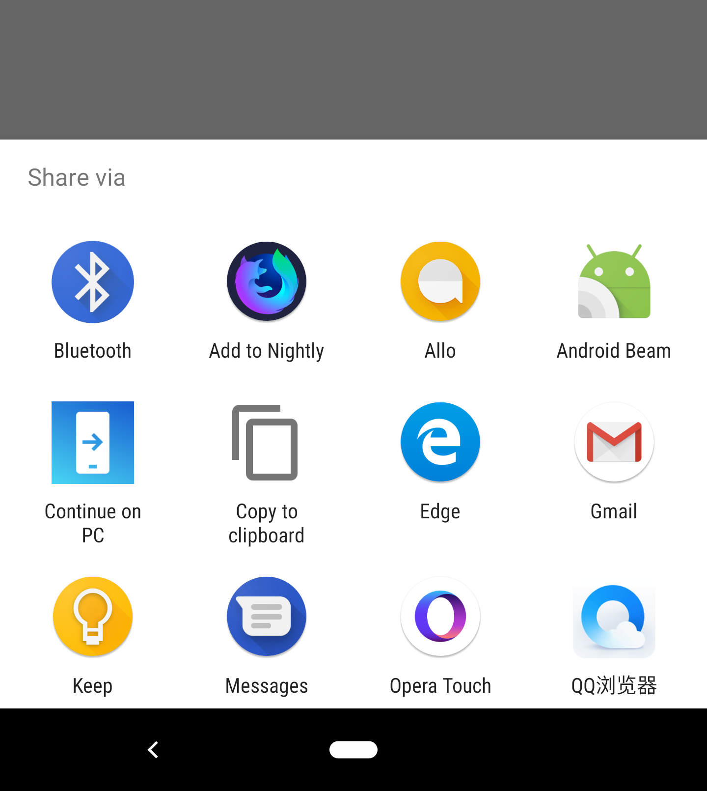
When a PWA is used in standalone or fullscreen mode there is no URL bar or browser’s UI on mobile operating systems which means a user can’t share the current content via message or social networks. On some browsers, such as Chrome on Android the app can use the recent Web Share API that will trigger the native share dialog from a custom user interface element.
On a click handler, the app will trigger a code similar to:
navigator.share({ "title": document.title, "url": location.href});
For other browsers, a PWA can use deep links to communicate with native apps. For example, if a link navigates to https://wa.me/<phone-number>/?text=<text>, the WhatsApp app will be opened and will open a chat to the specified phone number (even if it’s not in the contacts list) and will fill the specified text. If no phone number is specified, the user will pick a contact from a dialog.
Rendering the right content for other Apps #
Users of mobile devices share content on social networks and messaging apps, such as Facebook, Twitter or WhatsApp. All mobile browsers have a Share action item that will trigger the native share dialog in the OS, and a PWA can also use WebShare, so it’s important to keep your content compatible to increase click opportunity.
The first important definition you need is the canonical URL. Sometimes apps add data to the URL, such as tracking information or have different URLs for mobile/PWA and desktop content. The ideal situation is to share a canonical URL that will be multiplatform; to define that URL a PWA can add a <link rel="canonical" href="">.
Then, Open Graph is the standard or defining metadata that all social networks use for creating the content visual snippet users see when browsing social apps. It’s crucial to set are at least og:title, og:description, og:url and og:image meta tags.
Storage Limits and Persistency #
When a Service Worker installs all the assets from your PWA typical questions appears: how much space can the app use and for how long? On iOS, each Service Worker can store up to 50Mb only, and they will be uninstalled from the system after a few weeks of inactivity.
The App’s icon will still be there, so next time the content will be downloaded again. On Android, the maximum package size is a percentage of the user’s available space and will be stored until storage pressure. On some Android browsers, a PWA can request Persistent Storage through:
navigator.storage.persist()Control Reload Gesture #

Some browsers offer a reload gesture when the user pulls down from the top. You can manage the pull to refresh gesture with the overscroll-behavior-y style on the body element. Using “contain”, the reload gesture will be disabled and using “none” will also disable the bounce effect.
Provide navigation within UI #
When a user accesses a PWA in standalone mode, there is no browser’s user interface and some platforms, such as iOS, don’t have back buttons or gestures to offer navigation. Therefore, it’s essential to provide all the possible navigation of the app within the boundaries of the web content.
Disable user selection #

When you design an app-like web experience, several sections of the UI shouldn’t be selectable, such as icons, sidebars and tab bars. To avoid selection of such elements or to trigger unwanted selections, the PWA can define the CSS style user-select: none on the elements that are not rendering data.
Prioritizing the Resources #
Web Performance is one of the critical aspects of a great Progressive Web App and helping the browser to render the content faster should be a designer’s top priority. Using <link> elements to specify resources that are important for the rendering critical path will make the browser start downloading them as soon as possible, even if it doesn’t know where to use them yet.
For example, if the app uses Web Fonts, to save precious milliseconds and set a high priority for it within the browser’s engine, it can add in the HTML <link rel=”preload” as=”font” href=”font.woff” crossorigin> and the font file will be downloaded before even the browser has parsed the CSS file with the @font-face declaration.
If the app doesn’t know the actual file it will need initially, but it knows that it will come from a third-party server, the <link> can use rel=”preconnect” or rel=”dns-prefetch” to speed things up.
Reactive Web Performance #
Responsive Web Design typically takes the viewport size, if it’s a touch device, and if the high-contrast mode is enabled to change layout; but in a dynamic world with so many devices and connections, we need to provide a consistent and pleasant user experience across all users no matter what.
For example, if the user is in a bad 3G connection, or with an LTE+ connection but with a cheap Android Go device with low CPU, memory, and GPU, we might not want to deliver the same content as to a high-end device on a good WiFi, even if the available viewport size is the same.
With modern APIs we can query client and server-side about total memory RAM available, current network bandwidth and latency, battery level, and rendering metrics. Based on that information, we might want to react and apply a different layout, image quality or amount of content loaded.
Modern Image and Animations Delivery #
One of the first problems with images on a PWA is not sending the appropriate size for that viewport and pixel density, thus delivering a bigger file that is necessary.
The app should use <picture> or the Client Hints spec on the server to provide responsive images. But also using new formats and compression algorithms will save bytes and rendering times, such as using the WebP format (evolving into the EVIF format for the future) or encoding your JPEG with the new Guetzli encoder or your PNGs with Zopfli encoder.
Regarding animations, designers should replace GIF files with Animated PNGs available on Chrome, Firefox and Safari or should use muted MP4 video files saving more than 90% of data creating a 20x faster experience.
While some modern browsers will accept muted mp4 files in an image, a PWA should have a fallback using <video muted -webkit-plays-inline autoplay> for the animation.
Render cheap and fast #
After the browser download and parse all your HTML, CSS and JavaScript the next important thing for performance is the rendering process. Based on how you are designing the project, the rendering can be faster or slower, can use hardware acceleration or not and can create a smoother experience while scrolling or animating.
One quick tip is to specify to the rendering engine which properties of an element will change in the future, because of an event, a transition or an animation. For example, a web designer can specify will-change: opacity on every element that she fades in or out, so the browser can optimize the engine for that.
Also, CSS Containment spec let a designer limits a browser’s ability to style, layout, and paint on some regions of your document. For example, contain: strict can be used on areas with predefined dimensions that won’t affect the rest of the page; contain: content is useful for default when the size is dynamic.
Use the platform’s abilities #
When creating PWAs authors don’t have access to just a screen and an input method. There is a good range of sensors, hardware and native apps available for the app to interact with and to create a better user experience. PWAs can access on all platforms to the user’s location, accelerometer, magnetometer (compass), gyroscope, orientation events, images from the gallery and to capture still pictures from the camera.
Using Progressive Enhancement (that’s the “P” in PWA) we can also use other hardware that might not be available on all platforms, such as Bluetooth, one-click Payments, Authentication, Push notifications, VR and AR, raw live video from the camera, audio output, speech recognition and more.
On PWAs for Windows Store, JavaScript has access to any Windows native API to integrate with the system, such as creating custom Tiles for the Start Screen, access user’s contacts or calendar.
Emulate and Debug your PWA #
Testing the PWA on all the possible scenarios is a must task for every web designer, but owning all the devices is almost impossible. That’s why there is a range of tools that will let designers emulate and debug without a real device. For Mac users, Xcode available in the store includes the iOS Simulator where PWAs can be tested on the whole range of iPhones and iPads.
On every desktop OS, Android Studio includes the ability to create as many instances of devices as we want including combinations of screen sizes, factor, and OS version. However, not every version includes Chrome and the Play Store to install more browsers, so it’s important to check if the emulator contains Play Store.

As a plugin for the Android ecosystem, a Chromebook emulator beta is available to download so the full desktop PWA final experience can be tested and debugged there without an actual laptop.
iOS User Interface tricks #
iPhone and iPad users need particular attention when designing a PWA to improve the user experience. Apple doesn’t support the theme-color property in the manifest, but we can specify status bar style through a meta tag <meta name="apple-mobile-web-app-status-bar-style"> accepting “black” or “white” as values. Then, when a user taps in a clickable area such as a link, a highlight box appears area over the element; that color can be replaced with -webkit-tap-highlight-color style always using a semi-transparent color such as rgba(255, 0, 0, 0.4) as value.

Finally, every link -including JavaScript internal links- in iOS will trigger a popup with more data about it using the long press gesture, unless the designer applies the style -webkit-touch-callout: none. Finally, for Safari on iPad, we can specify not to render the content as a fullscreen iPad while in Side or Split View (multi-app view) using the viewport’s declaration shrink-to-fit=no.
Launch Images #
All Android browsers compatible with PWAs will create a launch screen from your manifest’s declarations automatically using an icon, the background color, and the app’s name. But iOS doesn’t generate those launch screens automatically, and PWAs need to set them up manually through link elements. That image is used on the opening animation and also in the multitasking mode, with a white image as default.

The PNG image has to be precise of the size of the actual screen, so several files must be served on different link elements with the right sizes property such as <link rel="apple-touch-startup-image" sizes="750x1334" href=""> for iPhone 6S, 7 and 8. For 7+, 8+ and iPads we also need to provide a landscape version and define it with a media query. If a designer doesn’t want to offer all the versions manually, some libraries such as AppCompat can help on generating them on the fly.
Limitations on iOS #
While Service Workers and Web App Manifest are supported since iOS 11.3, there are some UX limitations compared with Android. It’s essential for every designer to know the barriers to make decisions for iOS users.
Apps will be reloaded every time the users get out of them, so authors should note that 2-factor authentications or OAuth login designs on different domains might not work correctly for PWAs sitting in the Home Screen.
Some APIs that are available in Safari might not work correctly from the Home Screen, such as WebRTC because it’s using a slightly different engine, so it’s essential to test every feature and not to think that if it works in Safari, it will work in the PWA. Finally, Safari doesn’t offer any install API or Web App Banner, so the only way to install it is to manually open the Share Sheet and pick “Add to Home.”
Avoid unwanted translations #
Chrome supports web content’s translation when the content and the user’s language don’t match. The problem appears when that behaviour also happens in a standalone app on every access to it and not just on web content.
So if the PWA offers internationalization within the app or if the author doesn’t want auto-translation, it can disable it through adding <meta name="google" content="notranslate"> in the HTML. If the author wants translation within the browser but not as an app, that meta tag can be injected dynamically only when a media query resolves, such as using the following code:
var isApp = matchMedia('(display-mode: standalone)')
                      .matches;
var head = document.querySelector("head");
if (isApp) {
     head.innerHTML +=
           '<meta name=google content=notranslate>';
}
Notch and iPhone X support #
If the PWA wants to take advantage of the notch available on iPhone X and some Android devices such as LG G7, it needs some work. By default, the designer can’t use that space, and bars or just a color replace it.
To use that space the viewport tag has to include viewport-fit=cover and then add proper padding values to avoid rendering content on the invisible notch area, rounded screen corners or non-clickable areas for global gestures. To make that padding compatible with all devices, CSS constants for the safe zone are available such as env(safe-area-inset-top) for the top padding. Note that before iOS 12, the CSS env function was named constant, so providing both names for some time will be necessary.

To use the full screen and render the app from the very top pixel of the display on home-screen apps the meta tag apple-mobile-app-status-bar-style needs to use the value black-translucent.
Link Capturing #

On Android with Chrome, PWAs have enabled a feature known as “Link Capturing” thanks to WebAPK, a feature that creates an actual Android native package when adding the app to the home screen. With that feature, the scope of the PWA defined in the manifest become essential not just to open external links in the browser but also because the PWA will own that scope within the OS.
So, let’s say the user installs with Chrome on Android a PWA from https://mydomain.app/mypwa. After it was installed, every link in that device pointing to a URL within that will be opened in the PWA window and not in the browser. So developers must assure that the PWA should adequately manage every link sent on social networks or emails within that scope. The feature is also available on desktop OSs with Chrome under a flag at the time of publishing this article.

This article was originally published in issue 279 of web designer magazine; this version includes more content

 by Maximiliano Firtman